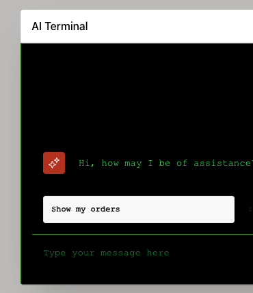
The Oracle AI Assistant is certainly recognisable by its distinctive theme, but how much can we customise it?
CSS
We can change the appearance of the AI Assistant in a number of ways.
The first approach is to redefine the CSS variables used by the Assistant. For example:
-a-chat-actions-state-background-color--a-chat-background--a-chat-body-background-color--a-chat-client-background-color--a-chat-header-padding-x--a-chat-input-button-border-color--a-chat-input-button-focus-background-color--a-chat-input-button-hover-background-color--a-chat-input-cancel-button-background-color--a-chat-input-cancel-button-hover-background-color--a-chat-item-alert-message-background-color--a-chat-item-inline-status-text-color--a-chat-message-action-button-background-color--a-chat-message-action-button-state-background-color--a-chat-message-border-color--a-chat-message-button-label-line-height--a-chat-message-error-icon-color--a-chat-message-input-border-bottom-left-radius--a-chat-message-input-border-bottom-right-radius--a-chat-message-input-border-color--a-chat-message-input-field-font-size--a-chat-message-pre-border-color--a-chat-message-pre-button-state-background-color--a-chat-notification-icon-inset-block-start--a-chat-notification-icon-inset-inline-end--a-chat-outer-container-border-color--a-chat-title-background--a-chat-title-color--a-chat-transcript-outline-color--a-chat-transcript-outline-style--a-chat-user-primary-icon-background-color--a-chat-user-primary-icon-text-color--a-chat-user-primary-message-background-color--a-chat-user-primary-text-color--a-chat-user-secondary-icon-background-color--a-chat-user-secondary-icon-text-color--a-chat-user-secondary-message-background-color--a-chat-user-secondary-text-color--a-chat-view-more-button-background-color--a-chat-view-more-button-border-color--a-chat-view-more-button-focus-background-color--a-chat-view-more-button-hover-background-color
Basically a whole range of variables, covering different aspects of the Assistant’s appearance. Thanks to Steve Muench for extracting these from the Universal Theme.
We can also go a step further and style other APEX components used by the Assistant, such as the t-Dialog classes.
For example :
:root { --a-chat-body-background-color: #000000; --a-chat-client-background-color: #000000; --a-chat-title-background: #001a00; --a-chat-title-color: #00ff66; --a-chat-user-primary-message-background-color: #002b00; --a-chat-user-primary-text-color: #00ff66; --a-chat-message-border-color: #005c00; --a-chat-outer-container-border-color: #008000; --a-chat-message-action-button-background-color: #001f00; --a-chat-message-action-button-state-background-color: #004000; --a-chat-message-input-border-color: #008000;}/* Terminal font throughout the chat */.a-ChatClient,.a-ChatClient .a-ChatItem-message,.a-ChatClient .a-ChatInput-text { font-family: "Courier New", Courier, monospace !important;}/* Assistant responses */.a-ChatItem--messageIn .a-ChatItem-message,.a-ChatItem--messageIn .a-ChatItem-message * { color: #00ff66 !important;}/* User messages */.a-ChatItem--messageOut .a-ChatItem-message,.a-ChatItem--messageOut .a-ChatItem-message * { color: #00ff66 !important;}/* Input box */.a-ChatInput-text { color: #00ff66 !important; background-color: #000000 !important; font-family: "Courier New", Courier, monospace !important; caret-color: #00ff66 !important;}/* Input placeholder */.a-ChatInput-text::placeholder { color: #008f3d !important; opacity: 1 !important;}/* Dark terminal-style APEX dialog */.t-Dialog { background: #000000 !important; border: 1px solid #008000 !important; box-shadow: 0 0 20px rgba(0, 255, 100, 0.15) !important;}.t-Dialog-header { background: #001a00 !important; border-bottom: 1px solid #008000 !important;}.t-Dialog-title { color: #00ff66 !important; font-family: "Courier New", Courier, monospace !important;}.t-Dialog-body { background: #000000 !important;}.t-Dialog-body .container,.t-Dialog-body .row,.t-Dialog-body .col { background: #000000 !important;}/* Close button */.t-Dialog-header .ui-dialog-titlebar-close { background: #001a00 !important; border: 1px solid #008000 !important; color: #00ff66 !important;}.t-Dialog-header .ui-dialog-titlebar-close:hover { background: #004000 !important;}.t-Dialog-title { font-size: 15px !important; letter-spacing: 1px; text-transform: uppercase;}
This is where Codex, Claude, etc. are your friends. Give them an idea of the appearance you’re after and they can produce the CSS in seconds.
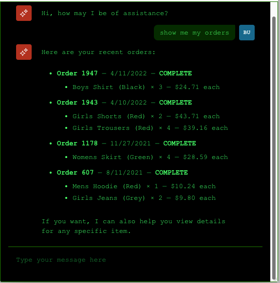
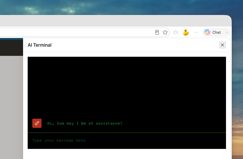
This is my attempt at a Terminal-style Assistant:
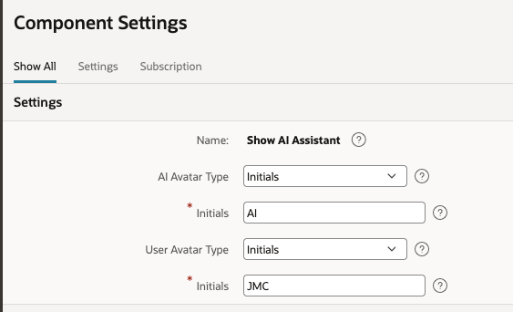
The avatar icons can also be changed under Shared Components → Component Settings. Unfortunately, a known bug in APEX 26.1 currently prevents this from working.
Modal Window
If you want more control over the Assistant’s window itself, there is another approach.
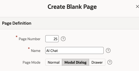
Instead of using the built-in modal Assistant, create an Inline AI Assistant on a new APEX Modal Page.
You’ve effectively recreated the Assistant inside a page that you have complete control over.
Create a new Modal Page and add an Inline AI Assistant region.
On Page Load – create a dynamic action to show the AI Assistant.
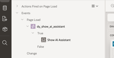
Set the Container Selector to the HTML DOM ID of the region where you want the Assistant to appear.
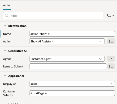
Set the HTML DOM ID in the Region.

You can then create a button on the calling page which opens your Modal Page.
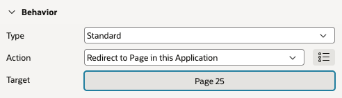
The window can now be customised using the standard APEX dialog settings. For example, you can:
- Set it as Non-Modal, creating a separate, independent browser window.
- Use Drawer positioning — top, bottom, start, end, etc.
- Control the size and maximum size.
- Configure the various dialog/chained settings.
- Add buttons and other APEX components.
- Apply your own CSS and JavaScript.
For example, the Assistant can be displayed as a drawer on the right-hand side of the application:
Why do this?
The biggest benefit is separation and reusability.
The Assistant has its own page, with its own CSS, JavaScript and configuration. This reduces the possibility of CSS or JavaScript conflicts and avoids overloading the calling page with everything required to support the Assistant.
The calling page simply launches it.
Also the same customised Assistant can be called from multiple pages, without duplicating the configuration or code.
The Assistant’s window now has enhanced behaviour, modal, drawer or non-modal, size etc and is controlled by the Assistant page itself, rather than being tied to the calling page.
References
Steve Muench https://diveintoapex.com/


Leave a Reply